
How I Chose a Calm, Cohesive Paint Color Palette for Our Home
- Karen Armstrong

- Mar 19
- 2 min read
Start with the Feeling
Before choosing any paint colors, I paused to put into words how I wanted the room to feel.
Calm.Grounded.Welcoming.Connected to the landscape outside our windows.
That became the foundation for every decision that followed.
Let the Room Lead
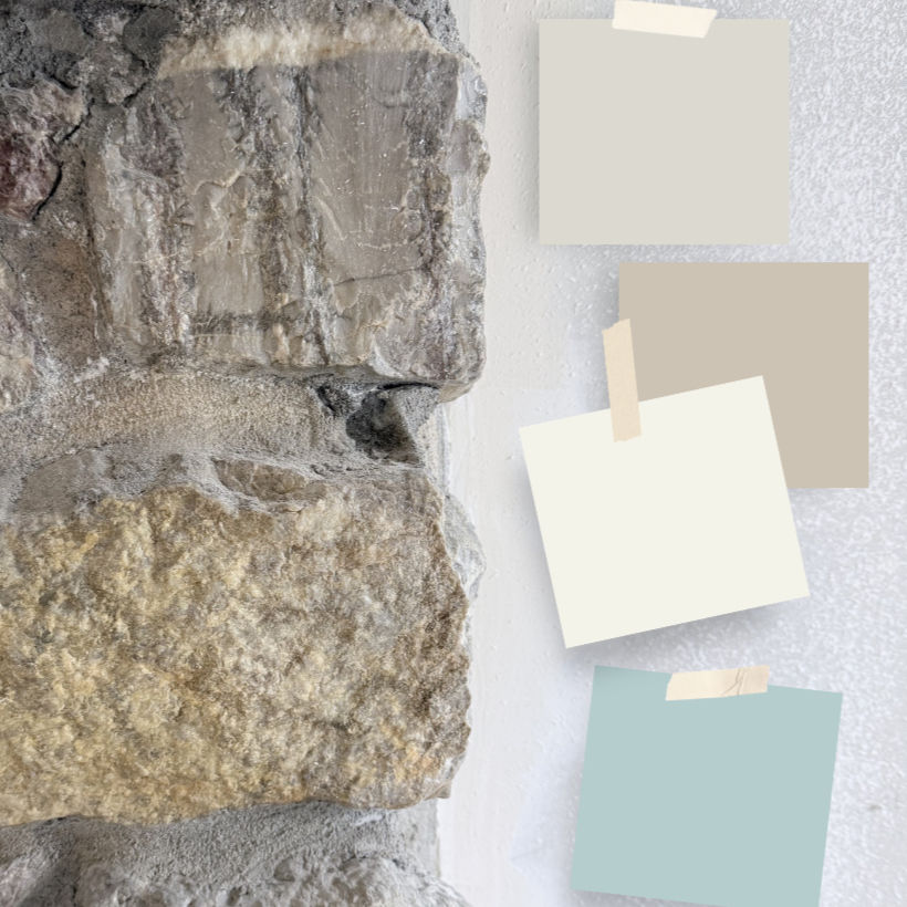
In our living room, the stone fireplace became the guide. Its mix of warm clay tones, soft grays, and hints of blue quietly suggested a palette that felt both natural and timeless.
Rather than working around it, I chose to work with it.
Often, the most cohesive spaces begin this way.
Pay Attention to Light
Color shifts throughout the day depending on natural light. As I worked through our palette, I studied large paint chips in the rooms themselves, moving them near windows and across the walls to see how they changed from morning to evening.
If you’re choosing colors for your own home, testing them in your space is one of the most helpful steps you can take.
A Palette That Feels Like Home
The palette unfolding in our home is a gentle balance of light and depth, warmth and coolness, drawn from the stone fireplace and the landscape beyond our windows.
Soft whites and light-reflecting neutrals with subtle sage and cream undertones create a calm foundation. Earthy clay tones add warmth and grounding, while soft blue-grays and muted blue-greens bring a sense of air, water, and openness.
Together, these colors shift with the light, allowing the rooms to feel both peaceful and alive.
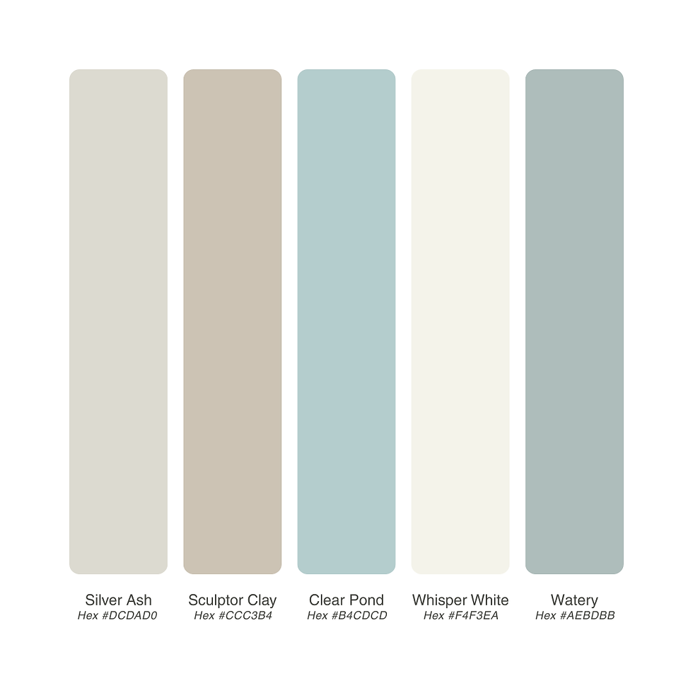
The Colors I Chose
If you’re curious about the specific colors, here is the palette I’ve been working with:
Behr Silver Ash (GR-W11) — a soft, light-reflecting neutral with a subtle sage undertone
Behr Whisper White (HDC-MD-08) — a warm, gentle white with a soft, welcoming feel
Behr Sculptor Clay (PPU5-08) — a warm greige that shifts between clay, taupe, and soft gray
Behr Clear Pond (PPU13-15) — a light blue-gray with a calm, airy quality
Behr Watery (HDC-CT-26) — a muted blue-green that feels fresh, soft, and slightly coastal
A Note on Finishes
Paint color is only one part of the story. Finish also shapes how a room feels.
Flat finishes soften light and create a calm surface, while satin finishes reflect light more gently and offer durability. In our home, I’ve been layering finishes to create both softness and subtle contrast.
Final Thoughts
Designing a home in this way isn’t rushed. It unfolds slowly, one thoughtful layer at a time.
Much like a painting, each decision builds on the next.
Join The Artful Season
If this way of approaching home and creativity resonates with you, I’d love to invite you to join my newsletter, The Artful Season.
Each letter includes:
seasonal reflections
creative inspiration
gentle art practices
and glimpses into designing a home with intention

Comments